Invicta FC 54
Invicta FC 54 marked a significant event in women's mixed martial arts, and the promotional material needed to capture the excitement and intensity of the upcoming fights. The objective was to create original Key Art that not only showcased the fighters but also resonated with fans by drawing inspiration from popular culture. This case study outlines the design process, iterations, and final execution of the promotional materials, culminating in a comprehensive social media toolkit.
Initial Design Concepts (Versions 1 & 2)
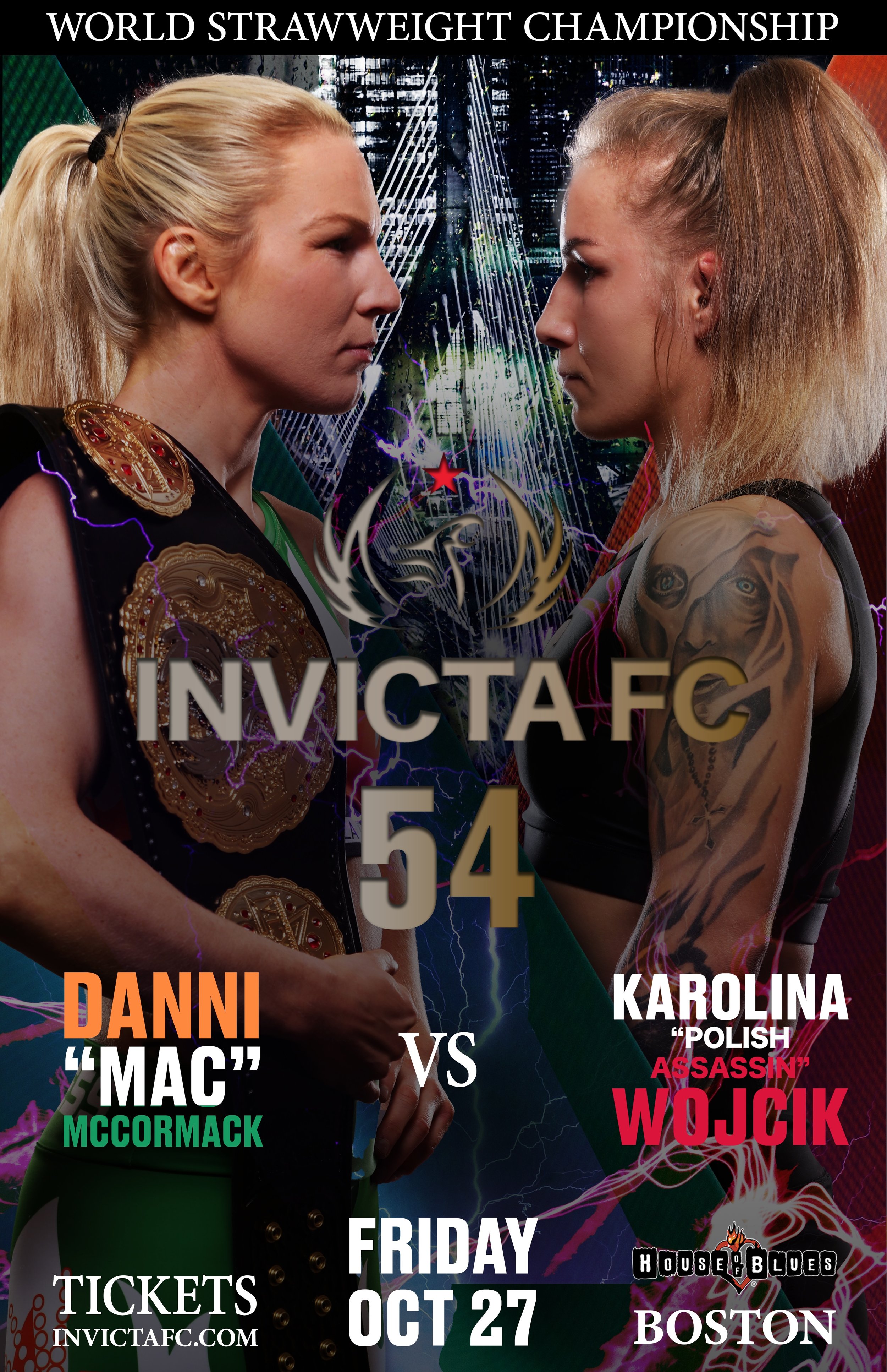
The design concept for this project was inspired by a mix of Mortal Kombat's style and superhero imagery. The goal was to create a striking and exciting poster that would catch people's attention and build hype for Invicta FC 54. Key visuals included the fighters facing off against each other, highlighting the upcoming showdown.
In this version, we were exploring ideas to create a 3D effect by having the fighters partially block the Invicta FC 54 logo at the top of the design. The background featured the Bunker Hill Bridge, giving a nod to the city where the fight took place. We also colored the fighters' names to match the flags of their home countries, Ireland and Poland, adding a personal touch to the design.
Version 1

In Version 2, we continued exploring the design but decided to make the Invicta FC 54 logo fully visible. We also reduced some of the shading to make the fighters stand out more clearly in the composition. We also added electric arcs at the bottom of the poster to enhance the Mortal Kombat and superhero vibe we were aiming for, giving the design more energy and intensity.
Version 2
Client Feedback & Challenges
The client appreciated the dynamic style but felt that the design could connect more strongly with the audience. They suggested trying different compositions to boost engagement. The main challenges were finding a balance between the intense Mortal Kombat style and the empowering feel of superheroes, while also making sure the fighters remained the focus without overpowering the overall design.
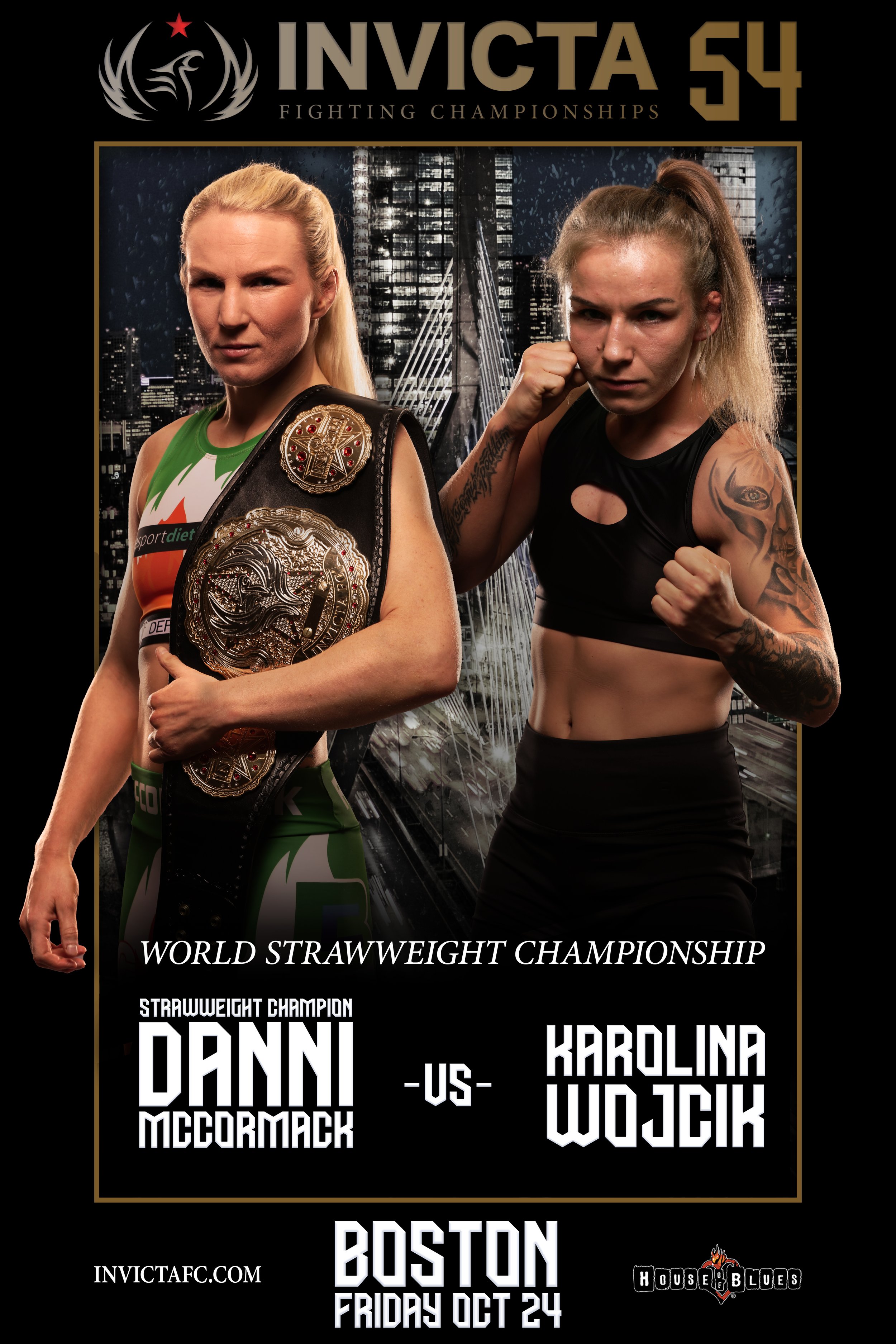
We decided to change the composition, positioning the fighters so they face directly toward the camera instead of each other. This adjustment was meant to create a stronger connection with the audience by making direct eye contact and emphasizing the fighters as larger-than-life, superhero-like figures.
To execute this new direction, we reoriented the fighters to face forward, which boosted their presence in the design. We also intensified the 3D effect to create the "pop-out" feel by adding each fighter to their own “Comic Strip” with limbs either hidden behind or on top of the central strip which still featured the Bunker Hill Bridge.
Design Iteration 3: Reimagining the Visuals
The new composition led to better engagement with the target audience, striking a balance between the original inspirations and the promotional objectives. The client gave positive feedback, praising the design for capturing the desired energy and aesthetic, paving the way for final refinements. The client also mentioned they would prefer a consistent background and suggested adding a border around both fighters. This would ensure the pop-out effect applies equally to both, as one fighter currently appears to be sinking rather than standing out.
Outcomes

Finalizing the Design: Focus on Fonts and Minor Tweaks
In the refinement phase, our primary objective was to elevate the design by focusing on typography enhancements and subtle graphic adjustments, bringing it closer to a finished product. We explored multiple avenues by developing three distinct versions, each offering a fresh take on font styles and visual details. This phase was about finding the right balance between boldness and readability, ensuring the text not only complemented the overall visuals but also enhanced the viewer's experience.
The process involved careful experimentation with various font sizes, styles, and placements, all designed to work in harmony with the poster’s dynamic composition. The goal was to ensure the typography matched the intensity and energy of the design, while still being legible and fitting seamlessly within the broader thematic context. We sought to avoid overwhelming the viewer while still creating a sense of excitement and power, using typography as a tool to drive engagement.
In addition to typography, we made subtle but impactful graphic tweaks. We refined the color contrasts to ensure that key information like the event details and fighter names stood out more clearly. Lighting effects were fine-tuned to give the design a greater sense of depth and dimension, amplifying the dramatic, three-dimensional "pop-out" effect. Lastly, we meticulously balanced the overall composition to guide the viewer’s eye through the poster in a natural, intuitive way. This ensured that the focus remained on the fighters while maintaining an engaging, visually cohesive design from top to bottom. These refinements set the stage for the final iteration, drawing the design closer to its full potential.
Final Version

In the final stage of the design process, after careful consideration and multiple iterations, the third version was selected as the definitive design. This version stood out for its ability to seamlessly integrate all the key elements in a way that felt cohesive and balanced. It represented the perfect synthesis of dynamic visuals and effective communication, capturing the energy and essence of the event while also meeting the client’s feedback and expectations.
One of the standout features of this final version was the striking typography. It managed to capture attention without taking away from the central focus—the fighters. The fonts were bold enough to be visually compelling yet subtle enough to allow the fighters to remain the stars of the design. This balance between typography and imagery was crucial in ensuring the poster communicated the intensity and significance of the event without feeling cluttered or overdone.
In addition to the typography, the visual effects were meticulously optimized to enhance the overall impact of the design. Special attention was given to the 3D elements, making sure they amplified the feeling of depth and dimension. The fighters appeared to "pop out" from the poster, drawing the audience’s eye and creating a sense of anticipation and excitement. This use of perspective and dynamic visual effects added an extra layer of engagement, making the final version not just visually striking but also emotionally resonant with the audience. Overall, this version achieved the goal of being both aesthetically impressive and functionally effective, setting the stage for the final presentation.
Building The Social Toolkit


To expand the poster's impact beyond print and into the digital space, we adapted the design for various social media platforms. The objective was to create a cohesive campaign that would maintain the energy and style of the original poster while fitting the unique dimensions and needs of each platform. This adaptation involved creating banners for Facebook, Twitter, and YouTube, as well as story templates for Instagram and Snapchat. We also designed shareable graphics featuring fight details and promotional messages to spread excitement leading up to the event.
Throughout this process, we focused on consistency, ensuring that the core visual elements from the original poster—such as the fighters, color schemes, and typography—were carried over to maintain brand recognition. However, we adjusted layouts to meet the specific dimensions and requirements of each platform, ensuring the design remained visually effective regardless of format. For engagement, we incorporated calls-to-action and relevant hashtags to encourage audience interaction. These elements were tailored to serve both pre-event promotion and live updates during the event, ensuring continuous engagement with the audience.
The results were impressive. The adapted graphics significantly increased the event’s reach, amplifying its visibility across multiple social media channels. Fans responded positively, praising the dynamic visuals, and the posts garnered strong interaction leading up to the event. This multi-platform strategy not only extended the event’s promotional reach but also deepened audience engagement, creating a buzz that carried into the day of the event itself.
Conclusion
The design process for the Invicta FC 54 Key Art was a collaborative and evolving effort that successfully balanced creative inspiration with the client’s objectives. Through careful consideration of feedback and a willingness to adapt the visual direction, we crafted a final design that blended the intensity of Mortal Kombat with the grandeur of superhero aesthetics. The seamless integration of this design across social media platforms helped amplify the event’s promotion, proving the effectiveness of cohesive and strategic design.
Key takeaways from this project include the importance of flexibility in design, as being open to altering core elements can lead to a more impactful result. Close collaboration with the client was also essential, ensuring that ongoing communication aligned the final product with their vision. Additionally, incorporating cultural references like Mortal Kombat and superhero themes can boost engagement, but it’s important to strike a balance with originality. Overall, the project not only fulfilled the promotional needs for Invicta FC 54 but also offered valuable lessons in design strategy that will be applied to future events.